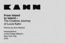
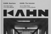
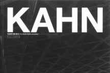
Kahn. Bold
Typeface, 2018
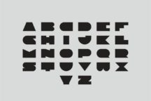
A prototype for a typeface dedicated to Louis Kahn
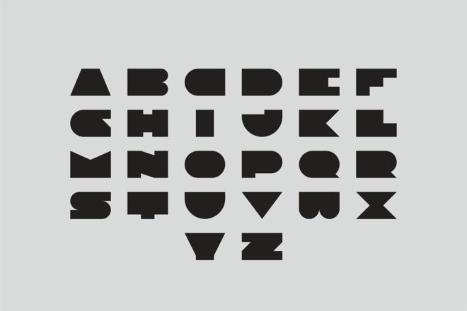
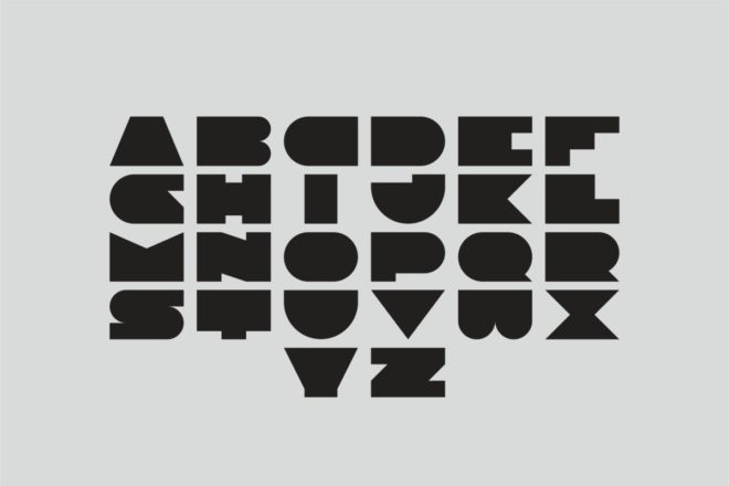
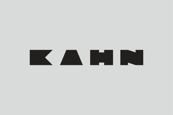
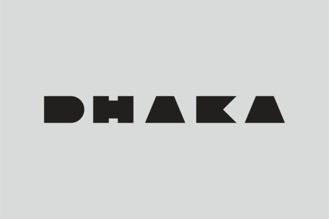
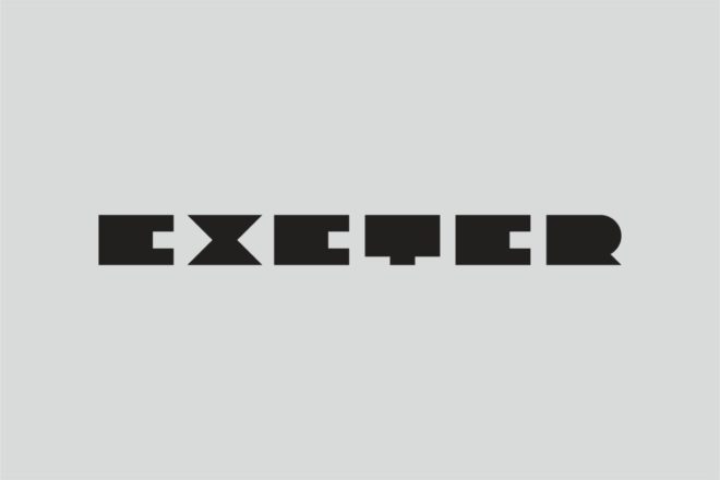
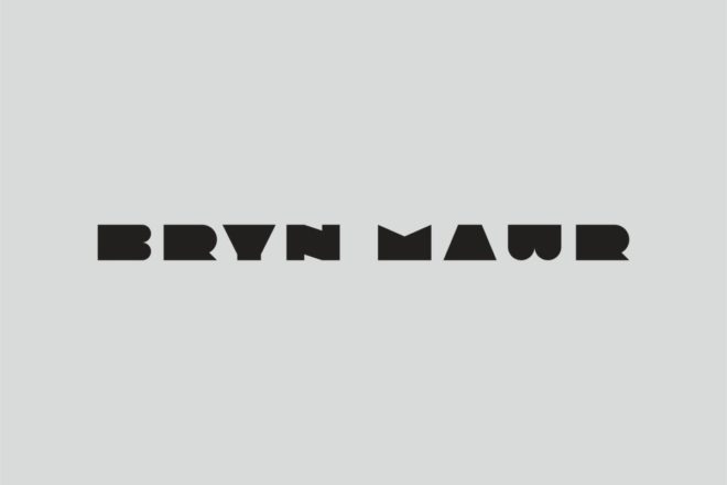
The Kahn. Bold typeface was motivated by the need for headlining publications and exhibitions related to Louis Kahn. Starting from the beginning in 2016, the typeface has developed to include the entire alphabet. Each letter has been treated individually. Its form, which is based on squares, circles and triangles, has been simplified to the maximum. However, the designer has not aspired to create an illustrative connection with Louis Kahn’s buildings.
The typeface is a prototype under construction.
Designed by artist and graphic designer Martin Pedanik.
